Available islands
There are 7 types of islands:
Viewpanels: shown as a tab in the main area, or as a drawer in the sidebarPreview: a single panel rendering the display as visitors see it, pinned beside the active main-area tab by the toolbar's preview toggleButtons: toolbar buttons, at the start or the end of the toolbarLibrarypanels: tabs of the Libraries sidebar panelContextualpanels: tabs of the contextual sidebar, shown while a component or block is selectedMenuitems: entries of the contextual menu, opened with a right-clickFloatingcontrols: attached to one or more main-area panels, only visible while one of them is the active pane
Visual positioning:
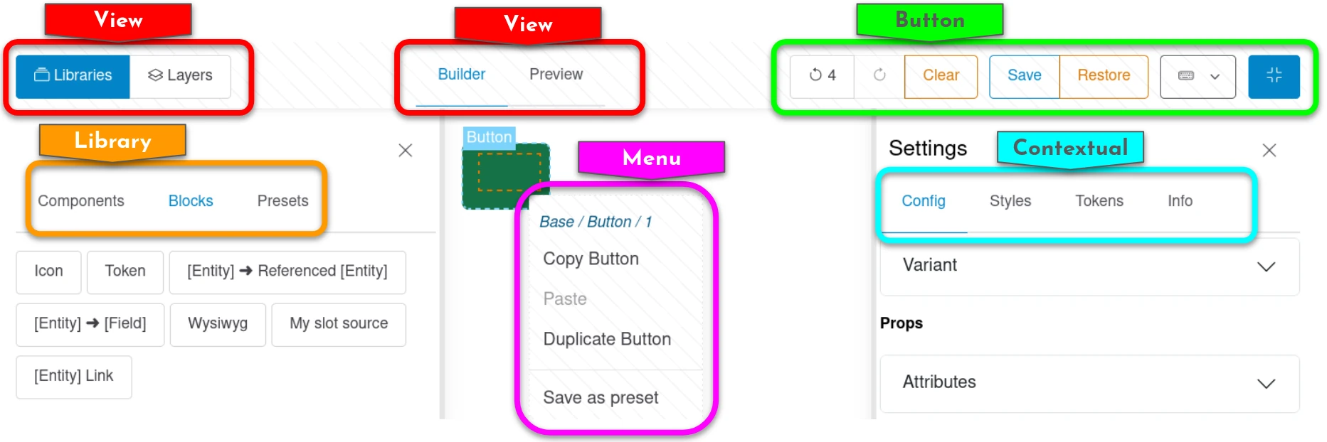
Display Builder is shipped with those ones by default:
View panels
For the sidebar
Instances
List all displays available to build and jump to any of them.
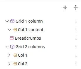
Navigator
Hierarchical view of components and blocks.
Libraries
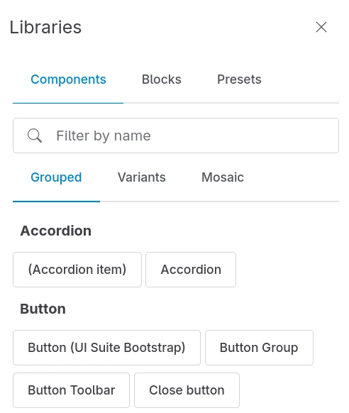
Pick elements from libraries and drop them in the display.
By default, 3 libraries are available:
- Components for SDC
- Block for all other data sources for slots (field, blocks, WYSIWYG...)
- Presets for pattern presets
For the main area
Canvas
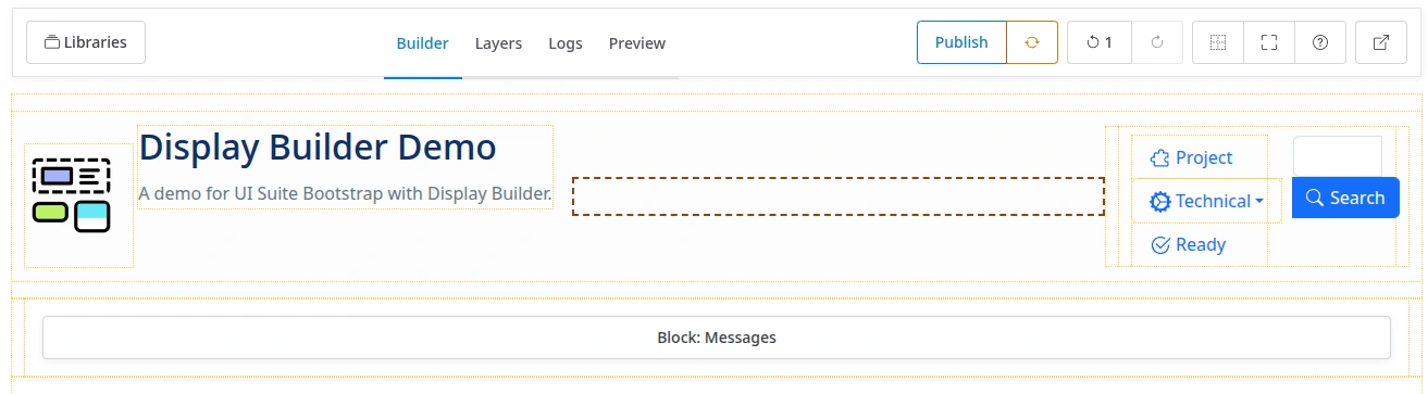
The Display Builder main island. Build the display with dynamic preview.
Scaffold
Schematic hierarchical view of elements without preview.
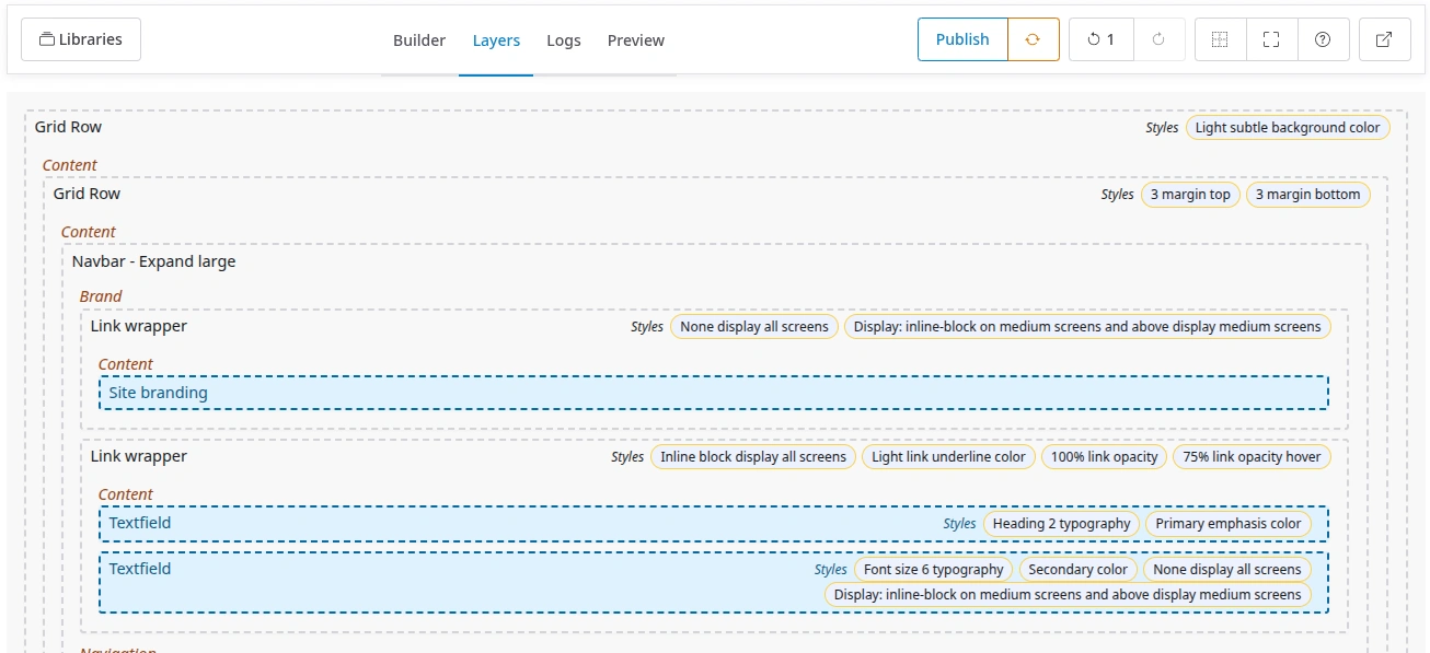
The schematic view is better for dropping components and blocks when the preview in the canvas panel is making things complicated.
Both Canvas and Scaffold share the same root dropzone. When nothing has been built yet, it shows a hint pointing to the Library panel instead of sitting there as a near-invisible empty strip. For examples: a modal, a sliding slider, a collapsing accordion is hard to manipulate when built.
A configurable allowlist of layout components (e.g. Bootstrap grid rows) is rendered with its real output instead, so the actual layout nesting is visible at a glance. Everything else stays a plain wireframe card.
Which components count as "layout" is theme-specific, hence a configurable list rather than a hardcoded one — set it in the island's configuration form.
Preview
Show a real time preview of the display, as visitors see it, without the builder chrome.
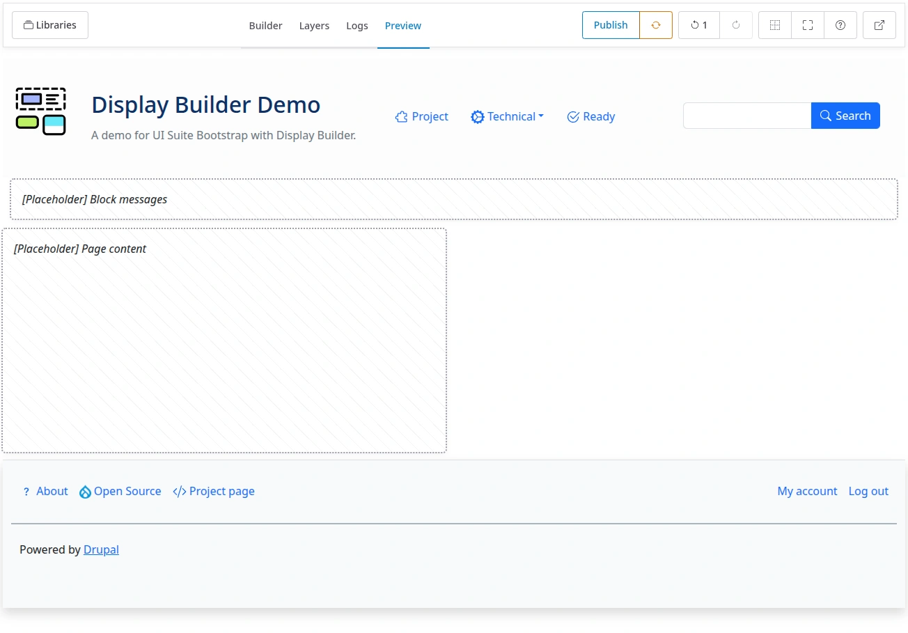
Preview is not a main-area tab. The toolbar's preview toggle (shortcut p)
pins it beside the active editor pane, Canvas or Scaffold, and a handle
between the two sets how much room each gets. Drag the handle all the way,
double-click it, or press Home on it, and Preview takes the full width;
the tab strip hides with the editor, and a panel shortcut (c, g) brings
the editor back. The handle is keyboard operable: arrows resize, Home
collapses the editor, End maximizes it, Enter or Space toggles. The
split and its ratio are remembered per builder in your browser.
Buttons
How a toolbar button looks is fixed by the island that builds it, not by the profile: Back, Expand, Theme, Help, Undo, Redo and the History log are icons, everything else is a label. Whether a button shows is the status of the island providing it, so an action nobody should reach is turned off in one place instead of being hidden in the interface while its endpoint stays open.
At the start of the toolbar
Save status
A small indicator confirming the last action reached the stored state.
At the end of the toolbar
History
Undo and redo changes. A third button opens a dropdown listing every past and future step: time, who made it, the message, and a checkmark on whichever step is currently published. The dropdown stays open while you undo, redo or keep editing, so the log can be watched as it changes. It closes on its own close button, on the same toolbar button, or on Escape.
🚧 2026-08-25: Revisions are currently limited to 20.
State
Publish and reset the display.
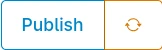
A Publish button, and a dropdown with the secondary actions:
- Publish (button, disabled while the display is already published in its current state)
- Restore (dropdown item, restore to last published version)
- Revert (dropdown item, for entity view override only, revert to default display for this entity)
Revert is the one the profile can turn off, being a power user action.
Expand
Expand the builder to cover the current viewport.
Theme
Pick a theme mode as light/dark/system for the display builder. Disabled by default.
Help
Information about the available keyboard shortcuts.
Language switcher
See translations.

Real-time collaboration
See real-time collaboration documentation. Disabled by default.

Back
Exit the display builder and go back to admin UI.

Library panels
Drag an item onto the Canvas, or click it to insert it without dragging. A + shows on the item under the pointer or the keyboard focus, and a line on the Canvas shows where it will land: right after the selected element, or at the end of the display when nothing is selected. Enter does the same as a click. The new element opens in the settings sidebar and becomes the selection, so a series of clicks keeps its order. A preset opens nothing. When the slot of the selection is full, the element lands right after the component holding that slot instead. With no room left anywhere, the item shows no + and a click does nothing.
Components
List of available components (SDC).
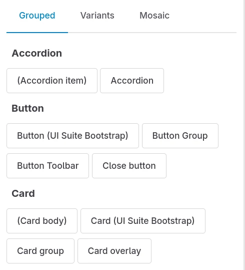
A specific configuration allow to pick available components.
Blocks
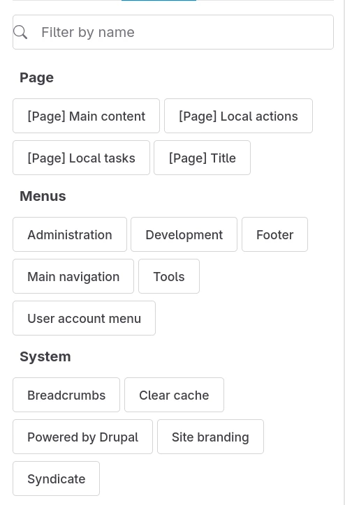
List of available blocks.
Presets
See patterns presets documentation.
Menu items
Available on secondary click on a block, component or slot, in Canvas or Scaffold panels:
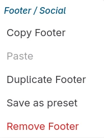
The menu title is the block, or component with tree position.
Main menu items
Copy, paste and duplicate the selected block or component.
Styles menu
Copy, paste, merge and delete the styles of the selected block or component.
Preset
Save as a preset. See also: patterns presets documentation.
Delete
Remove a component or block with all children.
Contextual panels
Config
Configure the active component or block.
Styles
Apply style utilities to the active component or block. Needs the UI Styles module.
Design tokens
Override CSS variables for the active component or block. Needs the UI Skins module. Disabled by default.
Visibility
Set visibility conditions for the active component or block.
Floating controls
A floating control is attached to one or more main-area panels and is only visible while one of them is the active pane. Unlike toolbar buttons, it lives with a specific panel because it is usually meaningless anywhere else (e.g. it depends on CSS scoped to that panel). It renders either in the header row of its pane, or as a small box pinned to the top-left of the pane, below the toolbar.
Highlight
Highlight zones to ease drag and move around. Attached to the Canvas, the one pane whose content is real component output the highlighting has to be layered over. A dropdown of independent toggles, all off by default: drop zones, components, blocks and visual spacing.
Scaffold options
Quiet the Scaffold down. Attached to the Scaffold panel, which needs the opposite of Highlight: there the outlines, names and spacing are the content, so every toggle is on by default and the control turns them off. Three independent toggles: drop zones, components and visual spacing.
There is no Blocks toggle: a block is a card in the Scaffold, and a card names itself in real text.
Responsive width and Zoom
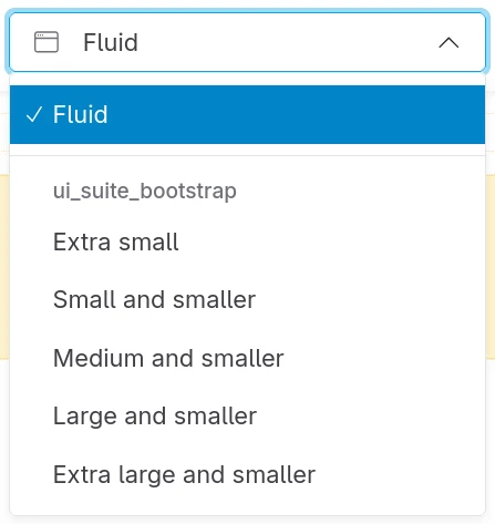
Switch the Preview between breakpoint widths to check responsive behavior, and scale it to 25, 50, 75 or 100% to see a wide layout whole. Sits in the Preview pane's header.
Chrome indicator
Shows, in the Preview pane's header, whether the preview renders wrapped in the site's page chrome or bare. See How displays nest for what decides it.
See also
- Configuring Display Builder - Configure islands in profiles
- Extend with island plugins - Create custom islands
- Pattern presets - Save and reuse component arrangements
- Real-time collaboration - Work together with other editors