Build your first display
This tutorial walks you through the core Display Builder workflow: enabling the builder on an existing display, placing a field and a component with drag and drop, configuring them, previewing, and publishing the result. It is the same workflow you reuse for entity view displays, page layouts and Views. It uses an entity view display because that one needs the least setup.
By the end, you will have replaced the static field list of the Article content type's default display with a composition you built visually, and published it so visitors see the result.
Prerequisites
- A Drupal 11.4+ site with Display Builder installed. See Installation.
- A content type with at least one field. This tutorial uses the Article content type and its Body field. Any content type with a field works the same way.
- At least one published Article, so you have a real page to check at the
end. Create one from Administration > Content > Add content > Article
(
/node/add/article). - An administrator account, or a role with these two permissions (see
Security model):
- Content: Administer display (
administer node display), to activate Display Builder on the Article display. - Use the Default Display Builder profile
(
use display builder default), to open the builder.
- Content: Administer display (
Note
Display Builder ships a ready-to-use Default profile, so you don't
need the display_builder_ui sub-module or a profile of your own to
follow this tutorial. Install it later to customize which panels and
tools appear. See Configuring Display Builder.
Note
Since Drupal 11.4, the Standard profile no longer creates the Article and Basic page content types: they moved to Drupal CMS. Core still ships them as recipes. Add Article, with its Body and Image fields, from the Drupal root:
Verify: Article is listed on Administration > Structure > Content
types (/admin/structure/types).
Step 1: Enable the module
Enable the entity view sub-module. Display Builder activates its own dependencies, UI Patterns and its field sub-modules:
You can also enable it from Administration > Extend (/admin/modules).
Verify: drush pm:list --status=enabled | grep display_builder lists
display_builder and display_builder_entity_view.
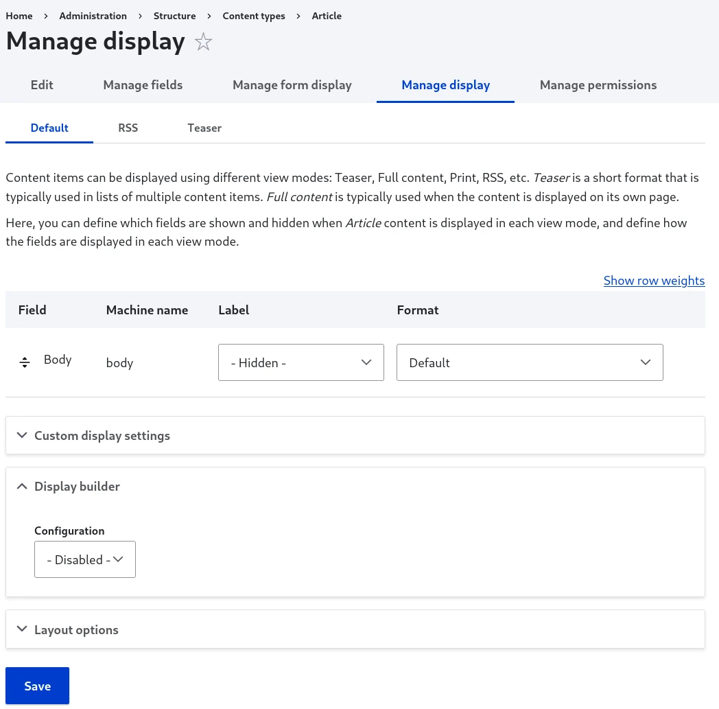
Step 2: Activate Display Builder on a display
- Go to Administration > Structure > Content types > Article > Manage
display (
/admin/structure/types/manage/article/display). - In the Display builder fieldset, pick Default under Enable with profile.
- Select Save.
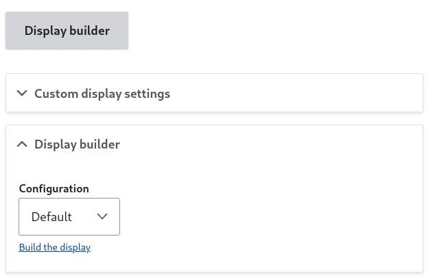
Verify: the field formatter table is gone, replaced by a large Display builder button:
Note
Activating Display Builder doesn't remove Layout Builder. Both can coexist on the same display, and you can switch back at any time. Only one tool renders the content, based on your selection.
Step 3: Open the builder and find your way around
Select the Display builder button.
The builder is made of islands, the panels and controls around the display. With the Default profile you see:
- A sidebar with Instances (every display you can jump to), Navigator (the hierarchy of what you placed) and Libraries, whose Components, Blocks and Presets tabs hold what you can drop.
- The main area, with the Builder tab (a live preview you drop into) and the Scaffold tab (the same content as schematic cards).
- The toolbar, with a save status indicator at the start and, at the end, History (undo, redo), State (Publish, Restore), Expand, Help and Back.
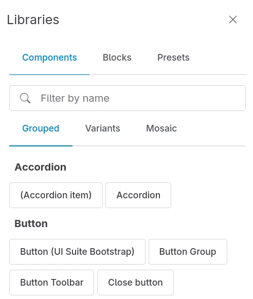
Verify: the Libraries panel, the Builder and the toolbar are all visible. The Builder is not empty: on first open, Display Builder imports the fields configured on Manage display, such as Body, as a starting point.
To learn what every island does, including the ones the Default profile leaves off, see Available islands.
Step 4: Add a field
Open the Blocks tab of the Libraries panel. Alongside Drupal blocks, it lists the sources available in the entity display context, such as the article's Title and Body fields:
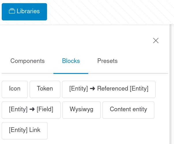
Body is already on the Builder, imported from Manage display. To place it yourself, right-click it on the Builder and select Remove, then drag Body from the Blocks tab back onto the Builder. While you drag, the drop zones highlight to show where it can land.
Verify: the Body field appears on the Builder, filled with sample content generated for the preview.
Step 5: Add a component
Open the Components tab. Components are the Single Directory Components (SDC) provided by your theme and the modules you installed, for example the demonstration components of the UI Patterns Library module if it is enabled.
Drag a component onto the Builder, next to or below an other element in the Builder.
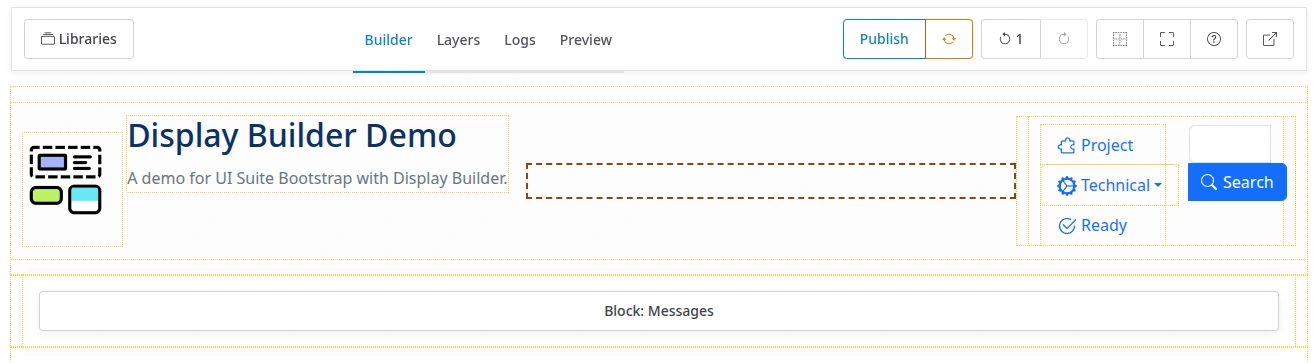
Verify: the component renders on the Builder in its default state.
Tip
Some components are hard to manipulate on the Builder: a modal, a slider,
a collapsing accordion. Switch to the Scaffold tab (shortcut s) to
drop into a schematic view of the same structure instead.
Step 6: Configure the element
Select the component on the Builder. The contextual sidebar opens with a tab per concern:
- Config: the component's props, and its slots.
- Styles: style utilities, when the UI Styles module is installed.
- Visibility: conditions that decide when the element renders.
Change a prop in Config, a heading level or a variant for example, and watch the Builder update.
Verify: the component on the Builder reflects your change, without a page reload.
Tip
Right-click an element on the Builder for its contextual menu: copy, paste and duplicate, copy and paste styles, Remove, and Save as preset. See Pattern presets to reuse an arrangement elsewhere. Drag an element to another spot to reorder.
Step 7: Preview the display
Select Preview in the Builder header (shortcut p). The display shows
over the Builder as visitors see it, without the builder chrome. Select it
again to get back to editing. The button next to it opens the preview in a new
tab, kept up to date while you edit:
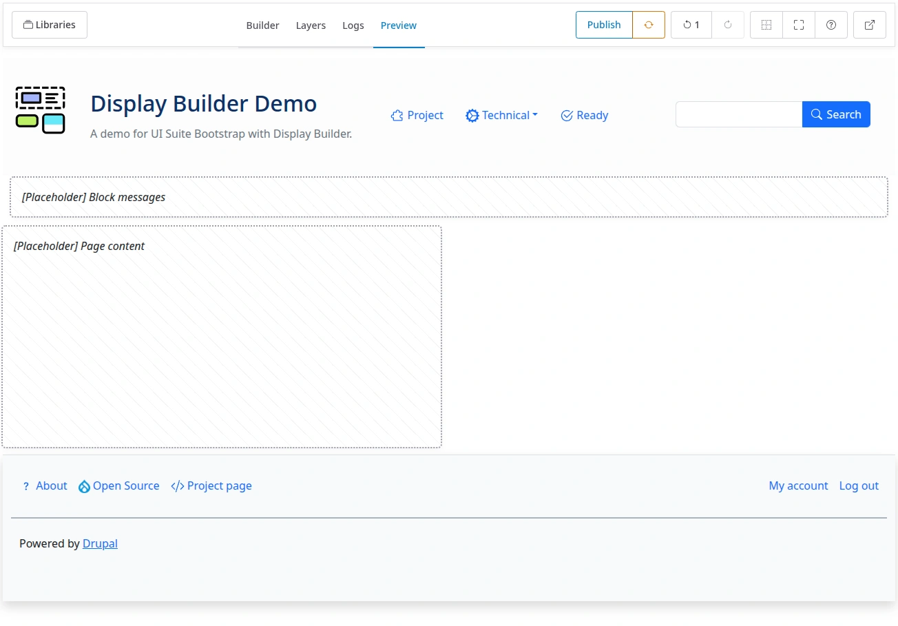
Use Responsive width and Zoom in the Builder header to check the display at other breakpoint widths. This control needs the core Breakpoint module.
Verify: the Preview shows your field and component together, and the layout adapts as you switch widths.
Step 8: Publish the display
Display Builder keeps your work in a temporary working storage as you build. It does not save to configuration on its own, so nothing is live until you publish.
Select Publish in the toolbar's State buttons:

The State buttons offer:
- Publish: write the current display to configuration.
- Restore: load the display currently published in configuration, discarding unpublished changes.
- Revert: return an entity view override to its base display. Not shown here, it only applies to overrides.
Verify: the save status indicator at the start of the toolbar reports the publish, and Publish is disabled until you change something again.
Warning
Your in-progress work lives in a temporary instance until you publish. Instances are not synchronized between environments, and a module update can drop them along with their history. Always publish before updating the module.
Step 9: View the result on the front end
Visit a published article, for example /node/1.
Verify: the article renders with the field and the component you arranged, in the order you gave them, instead of the default field formatter output.
You built and shipped your first display.
Next steps
- Entity view displays: the reference for the workflow in this tutorial, and how to apply it to other view modes like teasers.
- Entity view displays overrides: let content editors customize the display of one item.
- Build a homepage from a landing page: apply the workflow to a landing page, then to a page layout for the front page only.
- Page layout: use the same workflow to replace Block Layout for whole pages.
- Use Display Builder with Views: apply it to a View's display regions.
- How displays nest: which builder owns what on a page, once you have more than one.
- Configuring Display Builder: tailor the panels and tools with profiles, for example a restricted component library for content editors.
If something looks wrong along the way, see Display Builder is acting weird, what can I do? in the FAQ.