Extend Display Builder with island plugins
The general idea of an “Islands” architecture is deceptively simple: render HTML pages on the server, and inject placeholders or slots around highly dynamic regions […] that can then be “hydrated” on the client into small self-contained widgets, reusing their server-rendered initial HTML.
Display Builder extensively uses HTMX's out-of-band swapping to allow an event triggered from an island to also update other islands.
There are 7 types of islands, the cases of the IslandType enum:
Viewpanels: shown as a tab in the main area (region: main), or as a drawer in the sidebar (region: sidebar)Preview: a single panel rendering the display as visitors see it, pinned beside the active main-area tab by the toolbar's preview toggleButtons: toolbar buttons, at the start or the end of the toolbar (region: startorend)Librarypanels: tabs of the Libraries sidebar panelContextualpanels: tabs of the contextual sidebar, shown while a component or block is selectedMenuitems: entries of the contextual menu, opened with a right-clickFloatingcontrols: attached to one or more main-area panels, only visible while one of them is the active pane
Visual positioning:
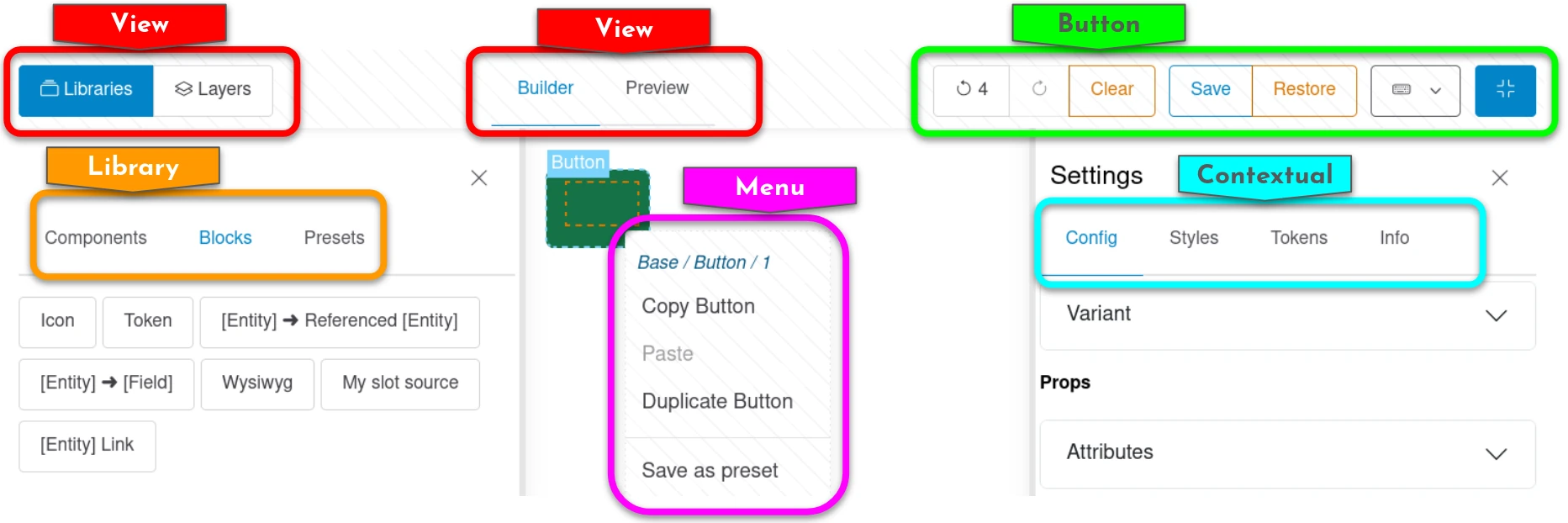
Interface
Notable methods:
IslandInterface::build(): Build the renderable content of the island from state data. This renderable can be annotated byHtmxEventsto trigger HTTP requests- Everything from
IslandEventSubscriberInterface: each method is an HTMX event dispatched byApiController(attach, move, active, update, history),ApiActionsController(delete, preset save, styles update, paste as attach) orApiPublishingController(publish, restore, revert). Islands receive callbacks for every state-changing operation:
| Method | Triggered when |
|---|---|
onAttachToRoot() |
A node is added at root level |
onAttachToSlot() |
A node is added into a component slot |
onMove() |
An existing node is moved |
onUpdate() |
A node's source configuration is updated |
onDelete() |
A node is removed |
onActive() |
A node becomes the focused node |
onHistoryChange() |
The history pointer changes (undo / redo) |
onPresetSave() |
A node is saved as a reusable preset |
There are similar methods for ApiPublishingController, which are related to action managed by DisplayBuildable plugins:
| Method | Triggered when |
|---|---|
onPublish() |
The builder state is published to the permanent storage (config or content entity) |
onRestore() |
The builder is restored to its last published state |
onRevert() |
An entity view override is reverted to the base display config |
The default base class (IslandPluginBase) returns an empty array for all events, so an island overrides only the ones it answers. Three traits cover the common cases with a full re-render: IslandStructureReloadTrait for the five structural events, IslandLifecycleReloadTrait for history, restore and revert, and IslandReloadEventsTrait for both. onActive(), onPublish() and onPresetSave() are not covered by any trait.
- IslandConfigurationFormInterface (a PluginFormInterface, with IslandConfigurationFormTrait): to make the island plugin configurable in the Display Builder profile (config entity)
- IslandWithFormInterface: for islands rendering a form class (IslandWithFormTrait), like the contextual Config and Styles panels
- isAvailable(): whether the island may render at all for this site and user; FALSE drops it from the builder
- isApplicable(): whether a Contextual island has anything to show for the selected node
- needsSse(): TRUE opens the server-sent event stream, see Real-time collaboration
- isDeferrable() / reload(): whether the island may be skipped while off screen, and how it is rebuilt once shown again, see PHP Architecture
IslandInterface::build() always returns a render array; an empty one empties the island. Event methods return the out-of-band render array to swap; an empty array leaves the island untouched.
Attributes
id: Plugin IDlabel: The human-readable name of the plugin. It is not derived from the ID and does not have to match it: the panels shipped by default are labelled Canvas (builder), Scaffold (scaffold) and Navigator (tree). Always reference a panel by its ID in code, config andattach_to.description: A brief description of the plugin.type: The island type from enumeration.region: The region the island renders in, for the types split into several:sidebarormainforIslandType::View,startorendforIslandType::Button. Structural, never a profile preference, since the regions of a type are built differently from one another. An island omitting it falls back toIslandType::defaultRegion(),mainandend.attach_to: ForIslandType::Floatingislands only: the plugin IDs of the main-area panels this floating control attaches to. It renders once, and is only visible while one of the listed panels is the active pane. Fixed by the plugin definition, not admin-configurable.pane_header: ForIslandType::Floatingislands only. WhenTRUE, the control renders in the header row of the pane it is attached to, as part of that pane's own chrome, instead of the small box pinned over the pane.enabled_by_default: Whether a profile created without touching this island has it on.modules: Other modules the island needs.IslandPluginManagerdrops the island from the list entirely when one of them is missing, so the profile form never offers an island that cannot work. Used by the Styles panel and the Styles menu (ui_styles), the Design tokens panel (ui_skins), the viewport switcher (breakpoint) and the language switcher (language).icon: Icon name for the island, where its type renders one (the Libraries tabs, for example).deriver: The deriver class, as for any Drupal plugin.
Example:
namespace Drupal\display_builder\Plugin\display_builder\Island;

use Drupal\Core\StringTranslation\TranslatableMarkup;
use Drupal\display_builder\Attribute\Island;
use Drupal\display_builder\Island\IslandConfigurationFormInterface;
use Drupal\display_builder\Island\IslandConfigurationFormTrait;
use Drupal\display_builder\Island\IslandPluginBase;
use Drupal\display_builder\Island\IslandType;

#[Island(
  id: 'block_library',
  enabled_by_default: TRUE,
  label: new TranslatableMarkup('Blocks'),
  description: new TranslatableMarkup('List of available blocks.'),
  type: IslandType::Library,
  icon: 'bricks',
)]
class BlockLibraryPanel extends IslandPluginBase implements IslandConfigurationFormInterface {

  use IslandConfigurationFormTrait;

}
Floating islands
A Floating island builds its own controls; there is no shared trait for
them. ProfileViewBuilder only requires build() to return a renderable,
and places it according to attach_to and pane_header. The shipped
ones show the pattern:
ViewportSwitcher(attach_to: ['preview'],pane_header: TRUE) builds one button per width in a privatebuildViewportButton()called in a loop, plus abuildZoomControl()select, and sits in the Preview pane's header row.HighlightToggle(attach_to: ['builder']) builds a dropdown of independent checkboxes inline, with thedisplay_builder:dropdownanddisplay_builder:menucomponents, and renders in the box pinned over the Canvas pane.ScaffoldOptions(attach_to: ['scaffold']) is its Scaffold counterpart, built the same way.
Two constraints a Floating island must respect:
- Name its buttons with a plain
titleattribute, never<sl-tooltip>: Shoelace computes a permanently wrong position for a tooltip inside aposition: fixedbox, and it is not fixable from the island. - Keep
attach_toa fixed, plugin-level list. It is not a profile setting, because a floating control is usually built for a specific panel's own layout and CSS.
Keyboard support
We provide a small utility to map buttons to keyboard shortcuts to ease actions in the Display Builder.
If your Island provide a button you should use our method \Drupal\display_builder\RenderableBuilderTrait::buildButton() to generate your button.
This method allow a keyboard mapping as parameter. Check the class for more info.
Every island has the static keyboardShortcuts() method from IslandInterface (empty by default). View panels and the Libraries panel override it to declare their shortcut.
Note: There is no control on duplicate, please ensure your shortcut is not already used.
A shortcut is declared as a canonical combo string: optional modifier tokens
then the key, joined with +, in the fixed order mod, alt, shift, key
— for example b, shift+p, mod+z, mod+shift+z, Delete. The mod token
is the per-platform primary accelerator, Cmd on macOS and Ctrl everywhere
else, so one declaration works on both an Apple and a PC keyboard
(@see components/display_builder/js/keyboard.js). A single button may list
several combos separated by spaces (e.g. mod+z u); the first is the one shown
in the help dialog.
Shortcuts taken by the islands shipped with the module:
| Key | Island |
|---|---|
c |
Canvas |
g |
Scaffold |
n |
Navigator |
p |
Preview |
l |
Libraries |
o |
History (logs dropdown) |
mod+z (or u) |
Undo |
mod+shift+z (or r) |
Redo |
shift+p |
Publish |
shift+e |
Expand |
mod+c / mod+v / mod+d |
Copy / Paste / Duplicate selected |
Delete |
Remove selected |
The contextual shortcuts (mod+c/mod+v/mod+d/Delete) act on the currently
selected node without opening the right-click menu; they resolve the node's slot
context the same way the menu does (@see components/display_builder/js/keyboard.js).